


Performance Analysis - Gains and Losses by MLS area DEC 2024 REVIEW
Curious to know how each MLS area has performed this year? How about since the All-time high and the start of the pandemic? We have all the data for you here!

Welcome back to another edition of our Performance Analysis series, where we break down the performance of individual MLS areas rather than relying solely on benchmark averages or aggregated data. By zooming in on specific neighborhoods, we aim to give you actionable insights that go beyond the broad strokes of the market.
This segment is designed specifically for professional real estate investors — specifically anyone working on shorter timelines who need to maximize returns while minimizing risk. Our goal is to provide area-specific performance data across multiple relevant timelines so you can make well-informed decisions tailored to your business strategy and holding period.
If you’re a homebuyer or seller, don’t worry —there’s still plenty of valuable information here to help you understand market dynamics in your areas of interest. However, keep in mind that personal satisfaction and enjoyment of your primary residence should remain your top priority when making decisions about where you’re going to live. Feel free to dive into the data and use it to your advantage!
As always, I’ll be breaking down benchmark price performance for every individual MLS area across three significant timelines:
Year-to-Date (YTD) Performance
Performance Since the 2022 All-Time High
Performance Since March 2020
These timelines have been carefully selected to provide distinct and relevant insights for different types of market participants:
Year-to-Date Performance: Critical for short-term investors like house flippers, developers, wholesalers, and you BRRRR enthusiasts out there.
Performance Since the 2022 All-Time High: Highlights the resilience (or vulnerability) of specific areas in the wake of interest rate hikes. This data is particularly useful for Realtors pricing new listings and for long-term owners evaluating their holdings post-pullback.
Performance Since March 2020: Serves as a measure of long-term strength from the onset of the low-interest-rate era through the recent rate environment. Ideal for buy-and-hold landlords, prospective homeowners, and anyone planning a longer-term investment strategy.
If there’s a specific timeline or metric you’d like analyzed, don’t hesitate to reach out—I’d be happy to discuss your unique needs in more detail, and include any relevant timeframe in future installments of this series.
Also - I am happy to share the Excel file containing this data with you. Please email keenan@judylindsay.com or text/call 204-955-0173 and I’d be happy to share for easier use.
Section 1: Performance Year to Date
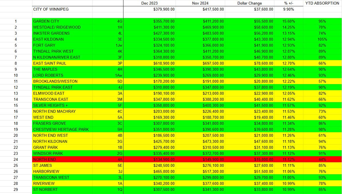
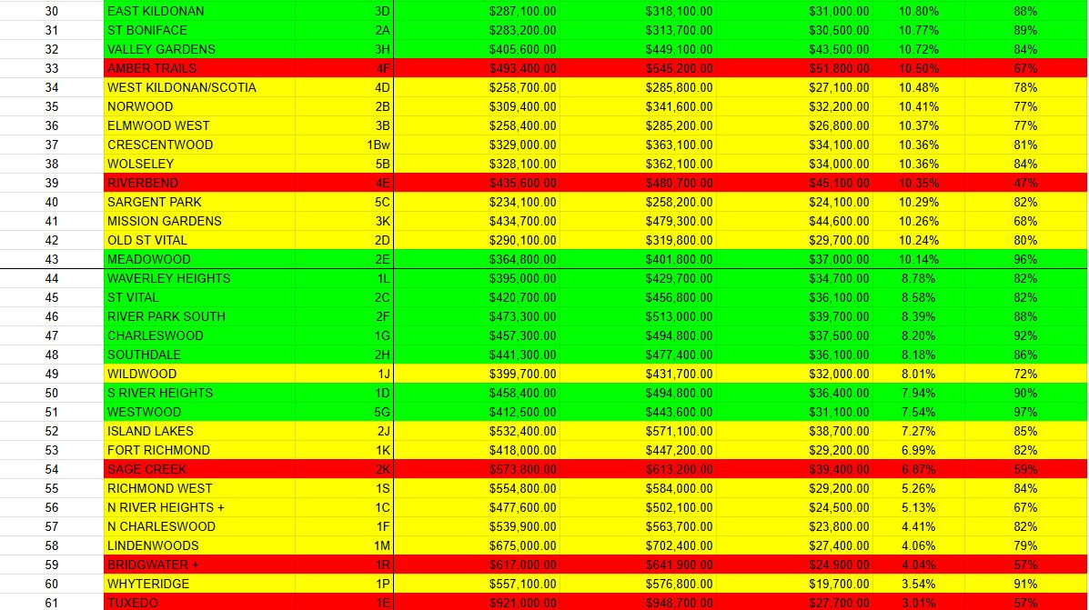
The above data is sorted by % gains this year, and ranked 1-61 on that basis.
I’ve amended the color coding for ease of use, see the changes from last time below:
Green areas = Great price point, high YTD absorption, significantly above average gains YTD. This is a fabulous area to flip property in the short term, and you may be able to get away with more optimistic assumptions here.
Yellow areas = Any of the aforementioned criteria are slightly lacking, but generally solid numbers across the board. Still an excellent area to flip property in the short term, but you should still be careful with your assumptions.
Red areas = Struggling in multiple ways. You can still do business in these areas, but be incredibly conservative in terms of both ARV expectations as well as timeline to sale. Caution here is ideal.
The data reveals that a significant majority of MLS areas in Winnipeg (43 out of 61) are outperforming the city’s benchmark price in percentage terms. Notably, several top-performing neighborhoods have posted impressive year-to-date (YTD) gains in the 12-15% range, with a large cluster concentrated around an 11-12% increase.
Among the standout areas, 4G Garden City, 3E East Kildonan, and 1Aw Lord Roberts have maintained exceptional performance. These neighborhoods have not only achieved substantial price gains but also demonstrated consistently high absorption rates throughout the year, even as prices accelerated. This highlights a continuing trend in 2024: MLS areas characterized by conventionally built homes in safe, middle-market neighborhoods (priced near the citywide benchmark) have shown the strongest demand and resilience. While a slight seasonal pullback in pricing and absorption has been observed in some of these "hot spots," they remain highly desirable.
Conversely, Winnipeg’s higher-priced areas have faced more challenges in 2024. However, there are some notable exceptions. For example, 3P East Saint Paul and 3J Harborview have performed well, offering large, upscale properties with semi-rural appeal—a lifestyle trend that has been regaining popularity after falling off post-pandemic.
On the other end of the spectrum, 1E Tuxedo continues to sit near the bottom of the performance rankings, though it has shown modest improvement compared to previous months. The slower growth in Winnipeg’s more expensive neighborhoods has been a consistent theme in 2024. However, areas such as 1E Tuxedo, 1M Lindenwoods, 1P Whyteridge, 1C & 1D River Heights, 1R Bridgwater, and 2K Sage Creek have seen improving price points and absorption rates. This suggests the potential for upward momentum in Winnipeg’s luxury markets as we move into 2025.
Section 2: Performance since the 2022 High
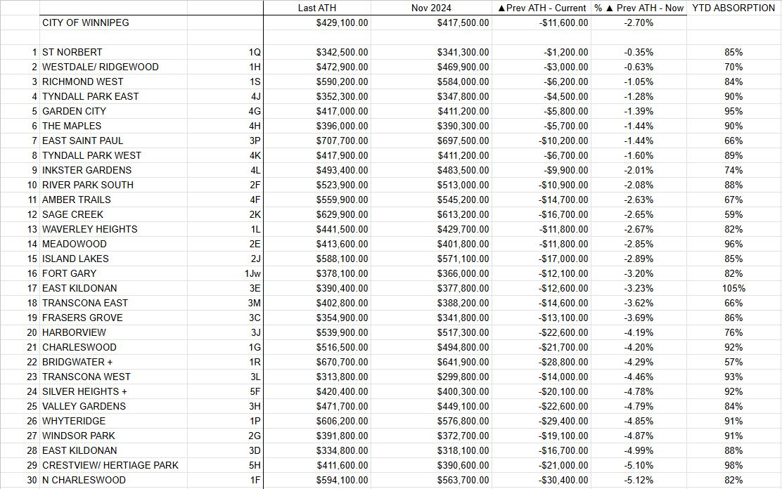
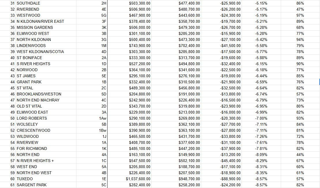
Analyzing the data from the 2022 all-time high to the present day, only 13 out of 61 MLS areas have outperformed the Winnipeg benchmark price, with notable differences emerging compared to the year-to-date performance trends discussed earlier.
The consistent theme of “secondary and tertiary” areas outperforming Winnipeg’s most expensive and traditionally desirable neighborhoods remains evident, mirroring the findings from the September update. Many of these middle-market areas dominate the center of the rankings, demonstrating overall strong numbers. Interestingly, however, the top-performing list includes a mix of Winnipeg’s hottest areas in 2024 and neighborhoods that have struggled with slow absorption and price action this year—an unexpected combination that deserves attention.
The recurring trend of “the most expensive areas and the most landlord-heavy areas recover last” is also clear in this quarter's data. For instance, 1E Tuxedo and 5C Sargent Park are both down 8.57% from their 2022 all-time highs, highlighting the challenges these areas face. Despite this, 5C Sargent Park presents some good news for investors: the neighborhood posted a strong 2024 performance with a year-to-date gain of 10.24% and a consistently high absorption rate of 75-85%. If this momentum continues, 5C could close the gap in the coming year.
In contrast, many of Winnipeg’s higher-priced neighborhoods have fared slightly better than 1E Tuxedo, largely due to the availability of new inventory and competitive price points in surrounding areas. For example, 1R Bridgwater, a neighborhood experiencing massive growth, has driven up benchmark prices while stifling absorption rates. This dynamic creates a unique challenge for investors considering Winnipeg’s luxury markets.
Looking ahead, the key question for 2025 will be whether Winnipeg’s premier neighborhoods can reclaim their dominance over the secondary and tertiary markets as interest rates ease—or if the lower and middle price points will continue to squeeze out the high-end areas for another year.
Section 3: Performance since March 2020
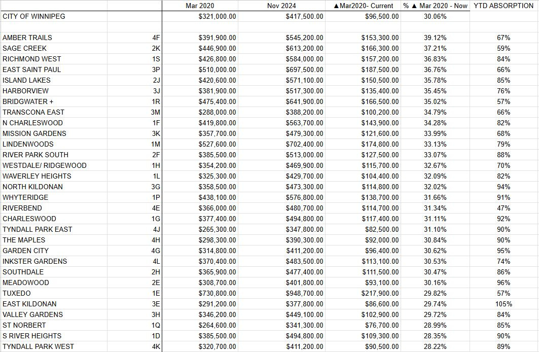
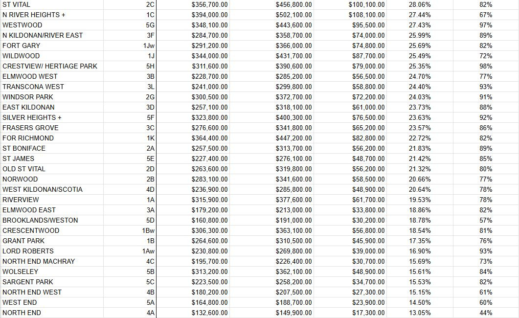
Currently, the City of Winnipeg benchmark price for detached homes is up approximately 30.06% since the pandemic's onset in March 2020. At the time of writing, 27 out of the 61 MLS areas analyzed are outperforming the citywide benchmark — a figure nearly unchanged from last quarter.
The best-performing areas remain consistent with previous installments of this series. Notably, 4F Amber Trails — along with the newer Amber Gates subdivision — continues to hold strong with nearly a 40% gain. Similarly composed areas across other quadrants of the city have performed comparably, driven in large part by the addition of expensive new homes, which skew benchmark prices upward. During much of the pandemic, builders prioritized larger, high-priced homes that were both profitable and highly marketable at the time. This influx of new, higher-priced properties likely lifted overall benchmarks in these neighborhoods. However, it’s important to note that much of this gain is somewhat illusory: while new construction has appreciated significantly, the typical 1–5-year-old owner-occupied homes in these areas haven’t kept pace. These homes face natural depreciation over time and must compete directly with builders offering brand-new products—often at similar price points.
The next tier of high-performing communities continues to include well-established and desirable neighborhoods featuring solid construction, generally priced at the upper-middle or upper end of Winnipeg's market. Areas such as 3G North Kildonan, 2H Southdale, 4J and 4K Tyndall Park, 1P Whyteridge, and 2F River Park South exemplify this category. These areas consistently appeal to Winnipeg’s upper-middle-class buyers and have shown steady benchmark price growth since the start of the pandemic. Unlike neighborhoods with heavy new construction, the data for these communities feels more "authentic," reflecting genuine appreciation rather than the influence of brand-new builds.
At the other end of the spectrum, Winnipeg’s lowest-performing areas since March 2020 continue to be dominated by inner-city neighborhoods and those popular with landlords, flippers, and developers. It comes as no surprise that the North and West End areas sit near the bottom of the list, with returns as low as ~15%, though more commonly hovering around ~20%. Areas such as 5C Sargent Park, 5B Wolseley, 1Aw Lord Roberts, and 1A Riverview are examples of this trend. While popular with investors, these areas feature older construction, which likely limits the prices buyers are willing to pay before turning to alternative options.
Interestingly, many of these same areas — 5C, 5B, 1Aw, 1A, and similar — have had an exceptional year-to-date performance. Their resurgence may reflect a growing appeal among price-sensitive buyers who are seeking affordable entry points into safe and value-rich submarkets. If this momentum continues, I wouldn’t be surprised to see these neighborhoods gain further traction in 2025 and beyond, as affordability remains top of mind for many purchasers.
Section 4: Conclusion
As we wrap up this quarter’s Performance Analysis, it’s clear that while the Winnipeg market has remained very consistent from last quarter, and has been telling us a similar story all year long. The divergence in performance across timelines and specific neighborhoods underscores the importance of understanding what your goals are as a buyer, seller, or holder of real estate. I hope the review of this data has made it clear just how divergent the overall return of different areas and property types have been over several different timelines.
Looking ahead to 2025, the key question will be whether the ongoing process of interest rate cuts can re-energize Winnipeg’s top-tier neighborhoods, or if the same affordability concerns we’ve been seeing since 2022 will continue to push buyers toward mid-priced or entry level areas. As always, my recommendation remains the same: make decisions that align with your goals and specific timelines. As always, it’s great to use the data to guide us, but truly understanding the meaning behind the numbers is what will ultimately set you apart.
Whether you're buying, selling, or holding, there are always great opportunities to be found in every corner of the city, and it is my hope you aim to take advantage of a deal or two in 2025. As always, feel free to reach out for the full dataset or to discuss anything that might help you navigate our market.
As always, I hope you found this information useful and interesting! Expect the next installment of this series in mid March 2025, following the release of the February dataset.